top of page
HappyCredit
Mobile App
Cashback App working at the intersection of fintech and e-commerce, to facilitate an easy shopping experience.
Project Brief
During my internship with Pen on Paper Technologies, I had the opportunity to work on the design of the app- HappyCredit. It is a startup that merges fintech and e-commerce, offering cashbacks and rewards to millions of shoppers in small towns of India. It has the aim to nudge 400 million shoppers.
My goal on the project was to design the e-commerce experience of the app, and create a flow that would help users find the most attractive deals and simplify their engagement with the app. The deliverables involved designing of merchant flows and cash-back activations, using a visual language that was consistent with the design system.

Role
Duration
Designing Wireframes
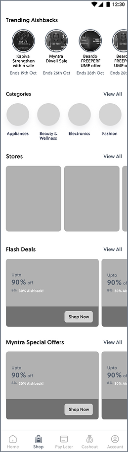
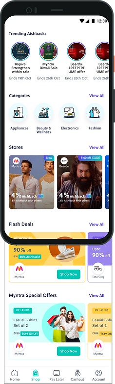
We started by sketching out a few initial wireframes to figure out the e-commerce navigation for the app. The primary goal was to make it easier for consumers to discover the various product offerings and discounts.
My reasoning was to segregate the different kinds of deals available to the users. I hoped to reduce the cognitive load that comes with endlessly scrolling through un-categorised pages which often increases decision fatigue.
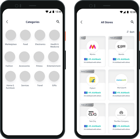
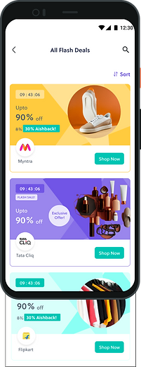
On the left are the different sections, starting with product categories, then the partner stores, available flash deals, and any brand-related special offers.
These were designed so as to give the user an immediate understanding of the various kind of categories up for offer, all on one page.
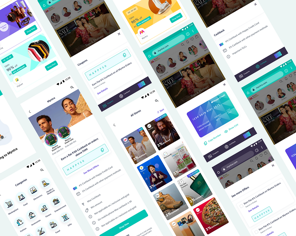
Clicking on “view all” would take them to explore each section in detail, and then further explore the product deals offered. (seen above)
Visual Design
While designing the Visual System, we had to keep in mind that HappyCredit was a product where deals from partner merchants would be accessed.
We had to make sure that the partner’s branded content would go with the existing colour and type systems of the app.
To tackle this, we ensured that areas where image content from other merchants would be displayed, minimal colours would be used. For all the sections that we were going to customise (such as banners and icons), we took more liberty in creating a UI that was vibrant and exciting, without becoming over-bearing for the users.
Approach and Elements
Attractive and fun
We wanted the look and feel of our design to be vibrant so as to make shoppers feel excited.
Icons
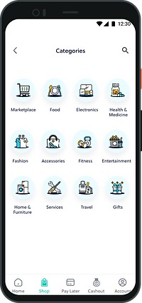
For the category icons, we decided to go with the outlined style, using the brand colours to make them pop.
Flash Deals and Special Offers
For each types of deal, we made similar banners, with small differences. One highlighted the product on sale and the other just generally brought to attention the special deals.


Style Guide
Colour
#FCF7F4
#FFC322
#5D3DE2
#DDD4FF
#1D1939
#55606F

I got an opportunity to work on creating the Style Guide for this project.
We set up the colour and typography system keeping in mind the brand guidelines.
Icon states, text fields, navigation bars, steppers and toast messages were some of the elements that I set up in the system.
Components

Key Takeaways
-
Created an engaging e-commerce marketplace that is now trusted and used for over 10 lack customers.
-
Helped create a platform that could further penetration into tier 2 - tier 6 cities, to facilitate an online shopping and cash-back experience.
-
Collaborated closely with the development team to ensure a smooth design handover process.
-
Created a comprehensive style guide to make the design process seamless.

bottom of page